User experience (UX) is a term you most often hear associated with product and product design. Good UX is the cornerstone of a successful product—however, the same principles can improve your email campaigns.
With hundreds of emails bombarding users’ inboxes every single day, your brand can’t afford not to think of the experience from the customer’s viewpoint.
Luckily, UX is an art that’s based in science, with a proven track record of guiding the consumer along their customer journey.
So what are some of the best practices you should use in your campaigns? We’re glad you asked.
Why does UX matter?

We have some good news! Thanks to the ubiquity of handheld devices, attention spans are actually getting longer when it comes to the amount of time that a user spends with an email.
Between 2011 and 2016, the average time spent reading an email increased to 11.1 seconds. Though it’s up only about 7% from previous years, that’s still one extra second that you have in front of a potential customer. And that’s just the average.
If you can make your campaigns eye-catching and engaging, which are more likely if you deploy UX practices, think of how long you can keep your prospect engaged with your brand!
Why does personalization matter?
Nothing will capture and hold the attention of a potential customer quite like a personal touch. This doesn’t mean simply including the recipient’s name, it means digging deeper.
People feel listened to, validated, and engaged if the content is tailored to their own interests and needs. It makes the brand look smart, and gives the consumer the feeling that they have an actual relationship with the brand.
For example, if a customer has purchased a particular item many times in the past, alerting them when it’s back in stock with a promotion will not only increase the likelihood of purchase, it’ll leave the customer feeling like they had a good experience with the brand.
Compare that to the UX when a customer receives a generic email from a brand. Macy’s, for example, sent out a Father’s Day email, listing some of “his top faves” as “women,” “men,” “shoes,” and “handbags.” For most recipients, this generic info dump will feel like Macy’s is barely paying attention and doesn’t care.
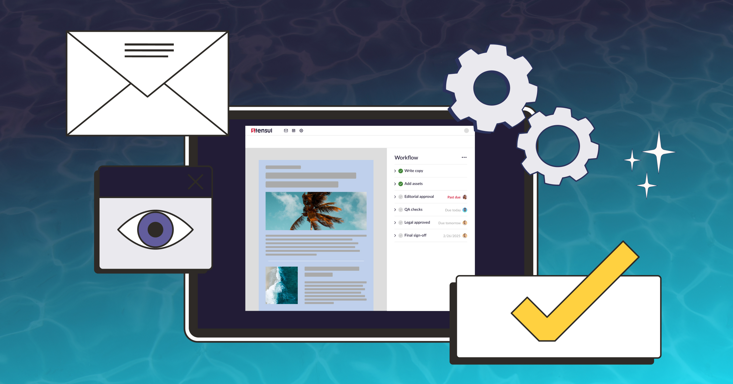
Platforms like Liveclicker allow brands to personalize their emails based on the recipient’s location, demographics, time, weather, and past behavior, so every brand should consider how they can best personalize their content to ensure each and every prospect feels listened to and validated.
Speed is of the utmost importance when it comes to good UX, as is keeping in mind that unless you hook a potential customer early, they may not stick around for too long. It’s best to insert personal touches in the beginning of the email, prominently displayed just after a (short) greeting.
Keep users scrolling

However, you shouldn’t waste all the good stuff at the top. Another important principle of UX is to establish early on that there is still important information below the fold.
Visual cues are one way to establish this, such as choosing long product photos so the row below the first row peeks through, encouraging the user to continue scrolling to see what’s waiting for them.
Having different colored blocks for different sections can work in a similar way, having an image end, some small padding, then another section poking out from just above the fold will potentially intrigue users to scroll a bit further. Make the FOMO work for you!
Staying short and sweet is the best way to keep customers engaged. Even if they have all the time in the world, chances are they won’t want to spend too much of their time scrolling. A compelling call-to-action shouldn’t take more than a few seconds to reach.
Use design to win them over

The best UX designers keep colorblind users in mind when they’re creating. Though they’re a small part of the population (though more if your demographic skews towards men), it’s simple and doesn’t cost anything extra to make designs accessible. White text on a red background is usually a no-go, and you should always add an overlay with low opacity when placing text on top of an image.
When you’re reaching out to users who will be using their mobile devices, contrast is important, as they won’t want to adjust their screen settings to read your email. Additionally, one color should be saved for your call-to-action buttons and only used for these buttons—it makes it easier for the user to pursue the next step with your brand when they want to.
It can be tempting to cheap out on the design of emails. It can take forever to get changes back from the designer and developers, and good design can be expensive. But simplistic, boxy-looking emails don’t offer the user any additional pleasure or joy in their customer journey. Bland design is a missed opportunity to enhance UX.
Brands often err in the other direction with overly cluttered emails. Brands are proud of their products, and they can have trouble deciding what to prioritize. Remember, more is not always better. Too much action and too much content will provide a bad UX—the recipient will be turned off by a sensory overload, instead of intrigued.
Most importantly, email designs should stay on-brand. Emails are only one touchpoint in a prospect’s interaction with your company, and the aesthetic and personality should align across all points. This helps to create a seamless UX that transitions easily from one stage to the next.
Brands that deploy various colors and styles across their collateral and packaging are not only forgettable, but they seem chaotic and, ultimately, unpleasant to interact with.
Give them a call-to-action they can’t ignore

At this point, the user should be thoroughly pleased with your email. Your dedication to UX has led them down the buyer journey but they just need that one final push.
For potential customers to find value in what you’re offering, you must offer them more than value, they must be inspired. Some of the best calls-to-action include either a free offer or the promise of a continued positive experience.
Productivity app Evernote challenges users to sign up by leaving them with the simple statement, “Remember Everything.” Netflix takes a different, but just as effective, route by using a red button that reads, “Try Free For a Month.” Both offers resonate with the potential customers’ needs and emotions, and are too good for the customer to refuse.
Building emails guided by the principles of UX will enhance the recipients’ willingness to continue their interaction with your brand. And if they like the experience, they’ll keep coming back for more.
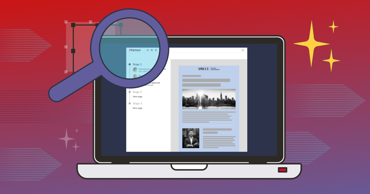
If you’re ready to improve your email UX and simplify the email building process, schedule your personalized demo today.