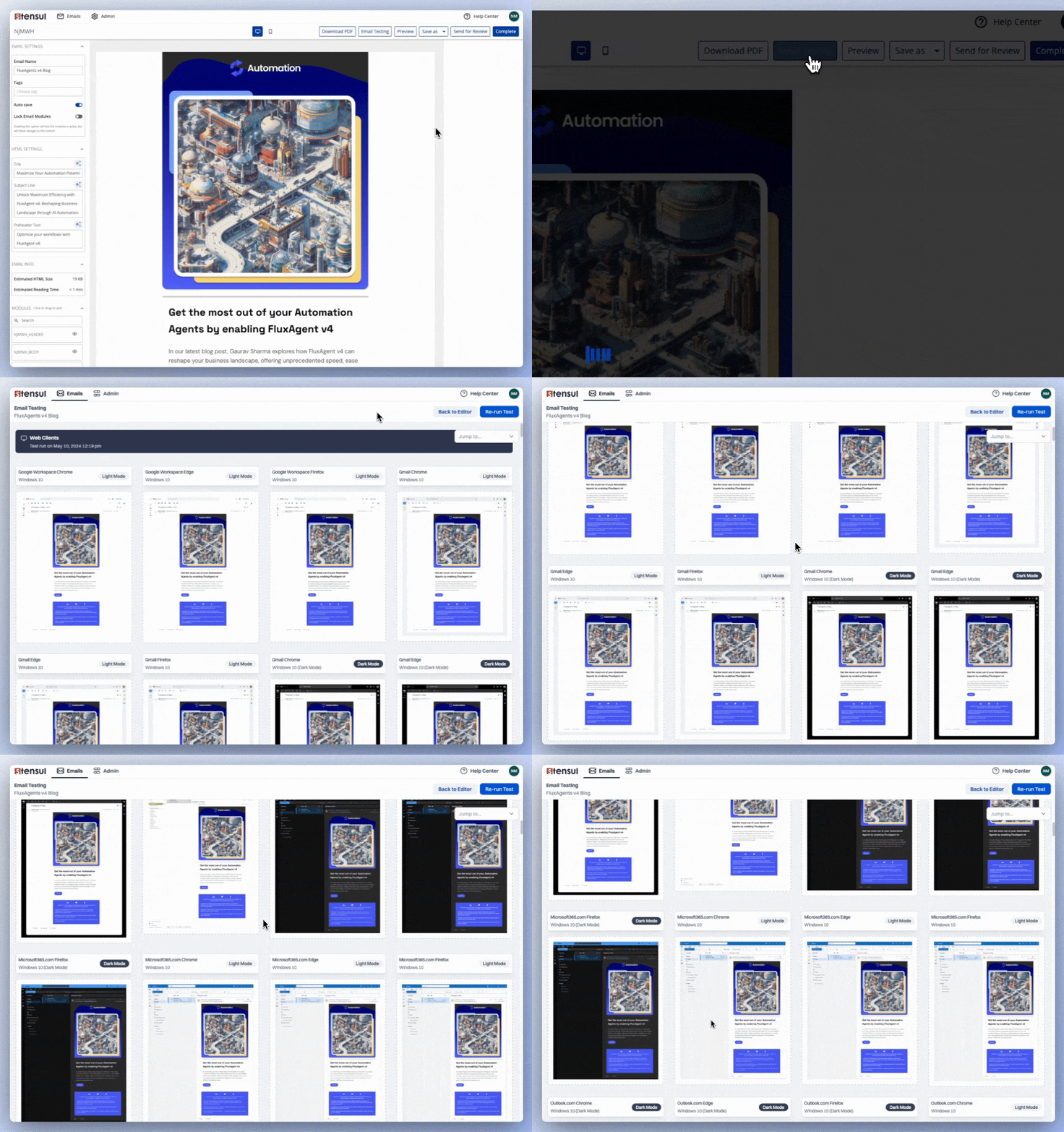
Preview different clients, light/dark mode, mobile/desktop without switching tabs or completing your HTML
Email render testing is a necessity. Yet it’s a time-consuming, often frustrating process. You send tests to an assortment of email clients and check to see if an email renders properly in light or dark mode or on different devices.
On top of that, you do most of the testing outside the builder used to create the email. If you happen to conduct render testing from an email builder, it doesn’t allow side-by-side comparisons, making it difficult to keep track of changes that need to be made in the builder. That usually translates to wasted time and errors.
Stensul recognizes all those concerns and addresses them with a new Email Testing feature that is integrated into the Stensul Marketing Creation Platform™.
Build emails and test them all in one place

Render testing button on Email Builder screen
No more toggling between screens or completing your HTML and manually uploading it to a different platform. Now your email builder can go directly from building to testing in the same modal when you click the Email Testing button located on the Email Builder page.
Get a bird’s-eye view of your previews

Bird’s eye view of email variations
Once you’ve rendered your tests, you can view your email across multiple scenarios—toggle between light and dark mode, compare mobile to desktop, and preview across multiple email clients to ensure the best possible email experience for your subscribers.
Find discrepancies in a flash
Click on a specific email to view the original email next to the preview. This side-by-side comparison capability is exclusive to Stensul. It eliminates the tedious task of recording needed changes based on what you see in the test app and then making sure they’re addressed in the builder being used. Stensul lets you save time and avoid errors that can consume even more valuable time.
With side-by-side comparison, you can catch typos, address email resizing issues, adjust inaccessible content, check on branding and regulatory compliance more efficiently, and correct those and other errors faster because it all happens in Stensul. It lets you preview all relevant email delivery scenarios before clicking on the email’s details, ensuring the best possible experience for your subscribers.

Side-by-side Comparison screen
Seamlessly toggle between previewing and building
Stensul Email Testing lets you switch between edit and preview modes without shifting tabs or completing the HTML. This Email QA activity is handled at the front end, avoiding the panic that can come from errors uncovered just before hitting the send button.
This approach to testing improves your ability to catch typos, address resizing issues, and adjust inaccessible content before it arrives in your subscriber’s inbox.


