Modular design is everywhere. Modular homes have mitigated Amsterdam’s housing crisis. BMW and Volkswagen’s modular car parts have saved the two German car companies millions of dollars. More and more marketers today are adopting modular email design, especially when it comes to email marketing.
So what exactly is modular design? It’s an iterative design system built from smaller parts (modules) that can be independently created and used across multiple designs. Modular design scales, minimizes waste, and helps simplify the complicated challenges in our world today, which is why more and more marketers are adopting modular design to streamline their frustrating email creation processes today.
We’ll go into more detail in just a minute.
Why Creating Emails Requires a Modular Approach
Email delivers the highest ROI of all marketing channels, averaging $38 for every dollar spent — and that’s not changing anytime soon. However, the typical process to create even the most basic marketing email is highly inefficient and doesn’t scale. Let me know if this process sounds familiar:
Traditionally, every new email requires an email brief that comes with a 1-week turnaround just to get the basic design laid out. Once the creation team populates the email template with content, they pass it on for the first round of testing and quality assurance (QA).
Every time a change is needed, even as minor as fixing a typo or changing the font size, that email goes back to the developers and designers for another round of review. Repeat the process a few times over, and you finally have an email that reaches your intended audience.
According to Litmus, it takes an average of 3.9 hours to get one email reviewed and approved before launch. This is because creation workflows are complex with complicated tech solutions baked into them. Here’s what a typical email creation workflow for an enterprise looks like:
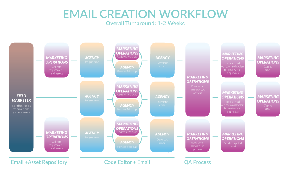
The same Litmus report states that it takes many large organizations 8-10+ hours of actual work to create one email, and one to two weeks to send one email. The bottleneck posed with email creation shifts the focus for marketers from producing great content to simply getting emails out the door.
What are Modular Emails?
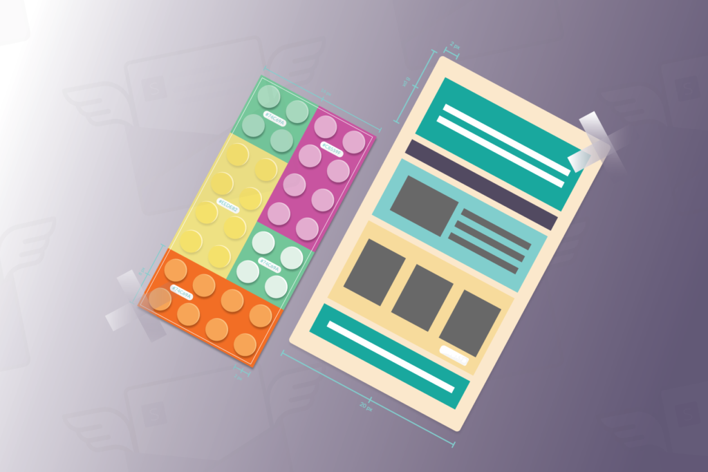
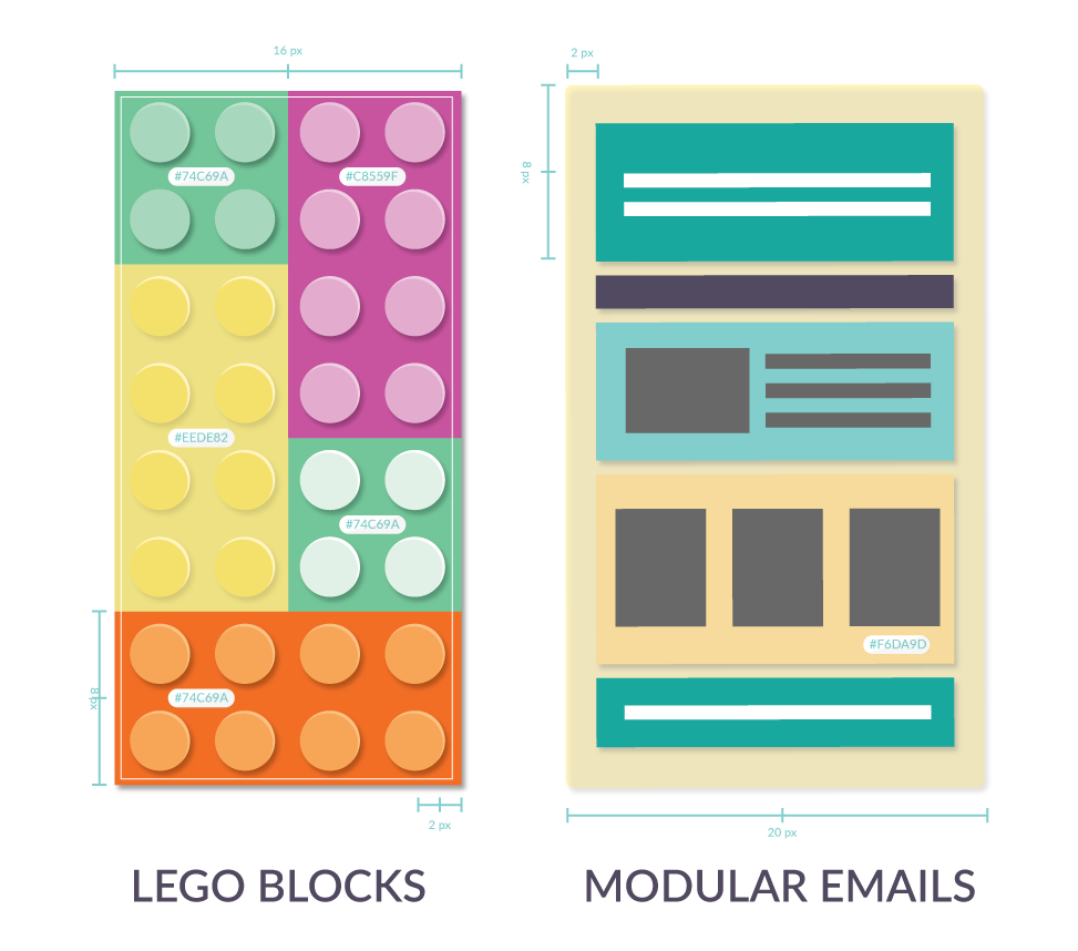
Think of modules as Lego blocks that can be moved around and positioned however you want, centered around your target audience, the types of email you’re creating, and your unique call-to-action. These Lego blocks ultimately build an entire Lego set in the same way modules build an email template.
Staying on Brand
By breaking templates into modules, you’re able to set specific brand guidelines for each.
For most enterprise marketing teams today, dictionary-sized brand guidelines dictate how every email should look and feel. While sticking to these guidelines is nearly impossible, many brand guidelines don’t even address email design at all. Creation teams have to manually match up correct brand colors, font sizes, and padding dimensions to the very pixel. Teams short on time often skip the smaller details and leave it up to ‘gut feeling,’ which ultimately compromises their brand.
Modules take abstract elements of email design and turn them into material building blocks (or content blocks) that scale. With modular emails, you can create and lock-in parameters around the minute details, such as the hex code and pixel alignment for each module, so every email moving forward is aligned with your brand.

While modular design may sound daunting, it doesn’t require a drastic and expensive overhaul. Further down this post, I’ll cover how your team can seamlessly adopt modular design today.
But first, let’s zoom out a bit and look at what a modular email actually looks like. I broke down this fantastic email designed by Vimeo the other day to help illustrate modular design.
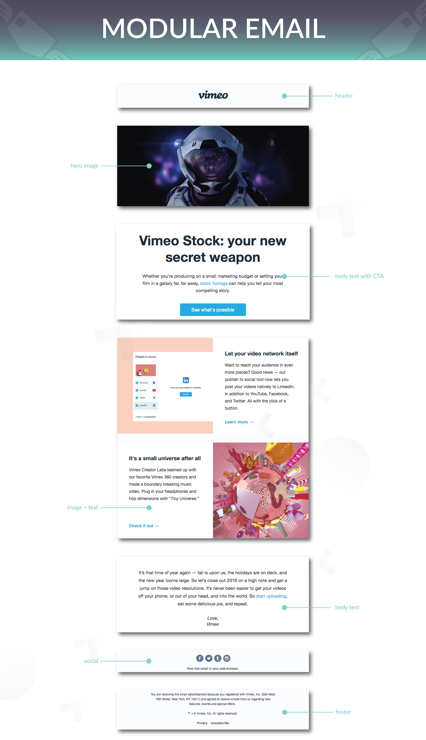
As you can see here, this email is broken into seven different modules: a header, hero image, three body texts, social bar, and a footer.
Each of these modules only needs to be built once and can be reused in any future email campaigns (or even within the same email). Once they’re tested and approved, anyone can build emails using the modules you’ve just built without worrying about breaking the code or building a completely new email from scratch.
Legal Compliance
Global email regulations like CAN-SPAM (US), CASL (Canada), and GDPR (EU) require certain language to be in the footer of every email. Failure to comply with these regulations increases the chances of your emails being flagged as spam or may even lead to significant fines. So don’t leave it up to chance!
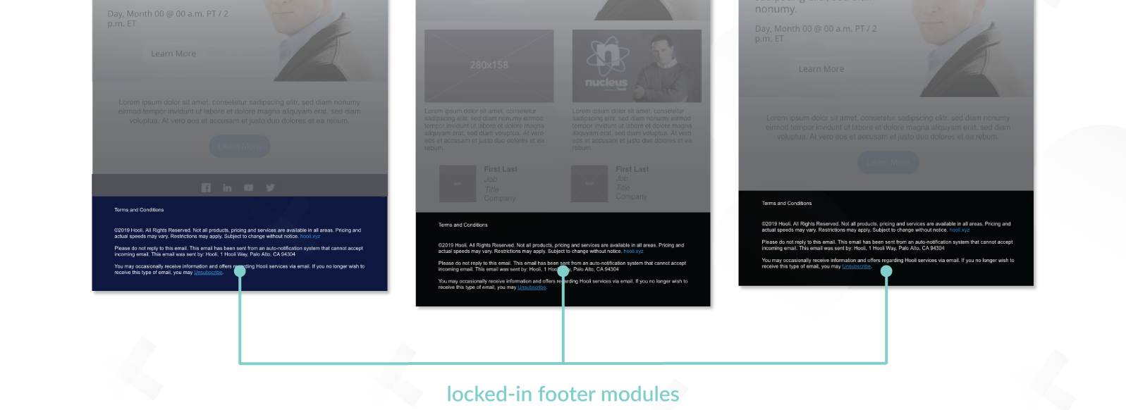
Email generation platforms like stensul allow administrators to lock-in elements of a module, which makes it impossible for any user to edit or delete extremely sensitive information. Do the work once, and you won’t have to worry about costly typos and copy-and-pasting errors ever again.
Future-Proofing With Modular
Emails, especially newsletters, are iterative in nature, so massive email redesigns and overhauls are both expensive and unnecessary. Updating the headers, email body, or footers can be done simply by swapping out a single module from your existing library.
The more modules you build upfront, the more varieties of emails you can create while maintaining organization and control at scale.
Let’s say your event marketing emails look 90% identical to your product update emails. Instead of going through the long process of building two different templates, you can quickly build one new module and duplicate the rest. Modules stop marketers from reinventing the wheel with every email.
By focusing on incremental updates on a modular level, you can keep your designs fresh and updated over a longer period of time. And in the off chance that something breaks, fix one module rather than an entire email, which means cheaper and quicker turnarounds for rapid deployment.

How to Adopt Modular Design
Step 1: Gather Your Wares and Document Your Use Cases
The first step to building a design system that scales is to perform an audit to fully understand your needs. Whether it’s in the form of a fact sheet or a spreadsheet, open up all your email campaigns. Then break them down by answering the following questions:
- What types of emails are you sending? Are they transactional, a newsletter, promotion, or a one-time announcement?
- What do my current emails look like?
- Which sections of an email are reused across campaigns? How often do your email templates get updated?
- How can each email be divided into modules? While there may seem to be millions of options here, you can start by bucketing your modules into the following categories:
- Headers
- Heroes
- Text Body
- Image Body
- Text & Image Body
- Spacers
- Social Links
- Footer
Step 2: Define Your Design Strategy
Modular design is about building blocks of content and arranging them in a way that drives the attention to a specific call-to-action. Begin strategizing your email design by asking the following questions:
- What sections of my emails should be locked-in?
- What are my brand specifications?
- What is the desired goal for this email?
- How much of the email is going to be images vs text?
- What elements do I want to draw the most attention to?
- Will the emails be single column, multiple columns, or a mix of both?
- How does this look on mobile devices?
- What sections of my emails will be powered by personalization and/or dynamic content?
- Once you’ve decided on how you want your emails to look, specify the guardrails you want to place around each element. Here’s what my guardrail specifications look like for my header module.
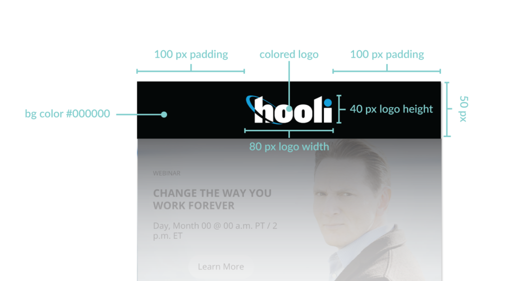
- Header height of 50px
- Header width of 280px
- Colored logo with a width of 80px and height of 40px
- 100px padding to the left and to the right of the logo
- 5px padding to the top and bottom of the logo
- Center aligned
- Black background color, hex code #000000
Just remember the more work you put in upfront, the easier your email creation process will be down the line.
Step 3: Build Your Modules
If you’re not using stensul yet, build out your modules in an image editor such as Photoshop or Gimp to start before sending it over to your agency or email editor. Remember to use consistent nomenclature and keep your folder hierarchies organized. Future you will thank you!
Step 4: Test and Iterate
Instead of updating designs on a whim, let the data guide you. Assign a Google Analytics or Adobe Analytics tag to each individual module to track how the each link performs. Be sure to A/B test each design, and see which modules perform best over time. Email generation platforms like stensul can show you which modules are being used the most and the least, which gives you insight into which modules you can deprecate or replicate over time.
Feeling the Modular Groove?
Ready to join thousands of marketers by adopting modular design for your emails? Schedule a call with us to see if Stensul would be a good fit for your brand.
Not there yet for modular design?
Check out Stensul’s premium email templates (all free!).
