When it comes to email creation, we’re all familiar with the age old push/pull between designers and marketers: designers want to design every email to the best of their ability, but heavy designs skew marketers’ plans when image elements don’t work with the code or take a very long time to load. This results in added frustrations and further back-and-forth communication that nobody on the team has time for.
Let’s look at three common ways email design is handled:
1. Heavily designed
Each email goes through an extensive design process, requiring hours of designers’ time. While this approach ensures that each email is unique and full of brand style assets, there’s potential of ending up with unsendable, un-optimized emails.. If every email from an organization is heavily designed, designers risk becoming overworked and team morale hangs in the balances. It’s important to make sure your talented design team isn’t reduced to “order takers.” Outside of the internal headaches heavily designed emails can cause, they’re more likely to cause long loading times, and the design assets can’t be easily transferred to future emails. There’s no way heavily designed emails can be distributed quickly and efficiently; a non-agile approach just doesn’t cut it.
2. A mix of design approaches
While relying exclusively on heavily designed emails is clearly not ideal, some emails do need to go through a full design-to-code process. Ideally these should make up 20% or less of your emails — a manageable amount for your team. This way, if certain special emails require a heavier design hand, more time to fix code or loading issues can be allotted. For other marketing campaigns like a monthly email newsletter, a webinar invitation, or time-sensitive updates can rely on templates or modules explained in more detail below.
3. Templatized or modularized
Relying on templatized or modularized emails for a majority of campaigns ensures that you can spend more time strategizing and less time creating. Overwhelmed email programs spend 90% of time on creation, needing to get emails out as soon as they’re designed and roughly troubleshot, and only have 10% of their time left for tasks like A/B testing, personalization, and strategizing. A mature email program should spend 90% of their time on strategy, and only 10% on creation, ensuring a smoother workflow and stronger email production overall. Plus, communication will improve, allowing marketers and designers to spend less time fixing mistakes or attending to requests and more time actually doing their jobs.

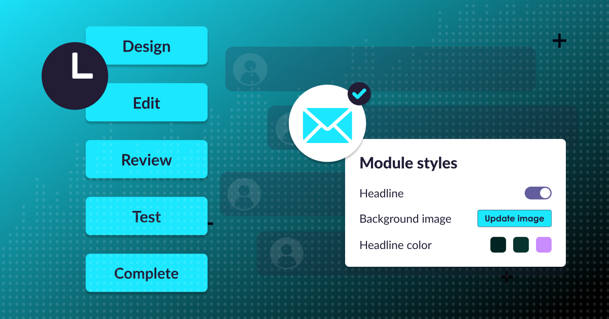
A creation platform like stensul allows designers to have a strong hand in creating modules marketers can then use like legos to build on-brand, ADA compliant emails. In a fast-paced, agile-focused environment, this sort of interdepartmental collaboration is necessary in order to send emails in a timely, accurate manner while ensuring that campaigns align with brand and accessibility governance.


